Measuring the Transit supply In Vancouver (*)
March 12, 2015
When it comes to service delivery, the TransLink narrative goes like this:
Delivered transit service hours have fallen behind the population growth since 2010 reaching levels last in 2008. That is leading to more crowding, more pass-ups and a worsening of the overall transit experience [1][18].
The graph presented to support this thesis is usually a truncated version of the below one:

A problem with this narrative using the total service hours delivered by the TransLink subsidiaries and contractors is that it magnifies the 2010 peak, by including service provided for the Olympic Games. A second issue is that it includes the technical services which could vary greatly without affecting the transit supply. Below is an example of such differences [2]:
| route | Revenue hour service | Total hour service | difference in % | All | 3,841,860 | 4,950,000 | 29% |
| 555 | 13,500 | 21,400 | 60% |
| 96B | 42,900 | 62,400 | 44% |
.
|
Revenue service or service supply means service dedicated to move transit passengers (passenger can use the provided service). Total service is the revenue service + technical service (deadhead run, layover…). That is matching the APTA definitions. Translink’s reports tend to easily interchange the both terms. |
The relatively important difference between the total service and the effective revenue service had already been noticed as an optimization avenue by the 2012 TransLink commissioner’s review [17]. The more fundamental issue is that the service/hour provided is not representative of the Transit supply:
- The replacement of a 40 foot bus by a 60 foot bus wouldn’t increase the service hours per capita, but it could address overcrowding.
- Faster bus routes infer less hours of service but are improving the service offer.
- The replacement of a bus route by a rail one, offering much faster and higher capacity vehicles, can both address crowding while improving the offer, while resulting in a decrease in total service hours.
Seat.Kilometres Supply
The seat.km metric; which needs to be understood as (seat+standee).km in the transit world; is a much better way to evaluate the transit supply, and for this reason is widely used in the passenger transportation industry.
As an example: 1 hour of coach service on the express route 555 using the Hwy 1 HOV lane can provide ~3600 seat.km when one hour of C23 Shuttle bus in Vancouver’s Yaletown, provides only ~320 seat.km. Differences in average speed and vehicle capacity drastically affect the offered service which is reflected by the seat.km metric:

The effect of the introduction of the Canada line service in late 2009 is clear. Though service hours may have stayed stable since 2011, the seat.km supply has slightly increased thanks to a greater use of articulated buses. The advent of routes 96B and 555, having higher speed than average, also provides more seat.km at constant service hours. Is this enough to keep pace with the population growth?

The point is moot. If a downtrend can be observed since 2011, we are nowhere near the 2008 level. The introduction of rapid transit lines tends to exhibit a positive long term trend.
Canadian and International Comparisons
To provide a larger perspective, the Vancouver transit supply is compared to other Canadian metropolitan areas, using numbers as provided by the Transportation Association of Canada [4]. The Vancouver numbers have been normalized to correlate with those provided by the association [5] . Vancouver tends to exhibit favorable trends when compared to its Canadian peers:
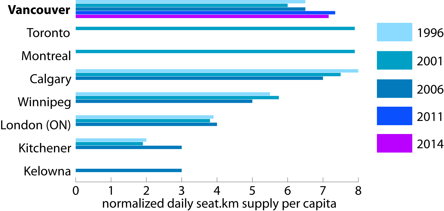
Vancouver pales when compared to Megalopolises such as Paris, London or Hong Kong [6], but its Transit supply is much greater than in Portland and comparable to the ones of European metropolises of population size closer to Metro Vancouver, such as Lille or Lyon [7]. Nevertheless, this comes with one caveat: both Lille and Lyon are fed by an important suburban train network which has not been accounted for in the following figure:

The above international comparison is assuming 4 standees per m2 to estimate the vehicle capacity [9]:
| system | bus | LRT | Metro | RER/MTR/Skytrain |
| Vancouver | 76 | 386 | ||
| Hong Kong | 105 | 146 [10] | 200 [10] | |
| London [11] | 79 | 252[12] | 728 | 509 |
| Paris [11] | 83 | 230 | 586 | 1772 |
| Portland | 76 | 166 [13] |
The Occupancy rate
Is the Transit supply good enough or not?
The occupancy rate [14] can be a good proxy to assess the relevance of the supply: the higher the occupancy rate is, the more likely crowding issues will arise. On the other hand, a low occupancy rate could suggest an excess of capacity.
Crowding experienced locally with a low occupancy rate could suggest that the transit supply deployment is not optimal, but some other issues could arise: A directional demand unbalance makes crowding difficult to address without deploying excess capacity on the underused direction.

Possibly a transit world specific: even the busiest systems don’t achieve an occupancy rate greater than 30%. In that light, the TransLink system appears to be a heavily used one.
It is worthwhile to note that TransLink estimates the average transit trip length at ~8km [15] when TfL estimates the average bus trip length at 3.5km and the Underground trip length at 8km [16]. Similarly the average bus or tram trip length is 3.3km and the subway trip length 5km in Paris. The reliability of trip length data could be an issue but a consequence of longer trips in Vancouver is that TransLink needs to provide more seat.km per trip than London or Paris.
(*) This article has been first published in the December 2014 newsletter from Transport Action BC.
[1] Mayors’ council on regional transportation Regional Transportation Investments: a Vision for Metro Vancouver – June 12,2014
[2] Difference between the GTFS data (revenue hr) and the Translink 2013 Annual report (Total service hr). see more in this post
[3] Supply is computed on the first Friday following Labour Day (usually one of the busiest Transit days of the year) of each year from GTFS schedule and fleet deployment observations. The vehicles’ capacity used are the maximum as displayed on the concerned vehicles. see more in this post
[4] Transportation Association of Canada. Urban Transportation Indicators, Fourth Survey. Ottawa :2010
[5] Numbers otherwise differ, possibly due to different assumptions, such as on the vehicles’ capacity. The urban areas, used by the association [4], don’t match either the area covered by the transport agencies, so numbers are subject to caution.
[6] Numbers for Paris come from the Observatoire de la mobilité en Ile-de-France, London numbers from TfL [16] and Hong-Kong numbers from the 2013 MTR Annual report.
[7] Number for Portland, including population, comes from the APTA, and includes the scheduled services provided by Trimet, C-Tran, SMART and Portland city.
[8] Numbers from the Certu (“Annuaire statistique Transports Collectifs Urbains”, 2014) with bus capacity normalized at 83.
[9] Agencies could have different standards (e.g. 6 persons per sqm in Hong Kong). The vehicle capacity is per bus or consist (train) unless otherwise specified. When different vehicle types are used, a vehicle revenue.km weighted average is used.
[10] The capacity is per car. Hong Kong Tram capacity is 125, and Hong Kong Airport train capacity is 120 per car.
[11] Vehicle Capacity number from Report on mobility an transport #1 – Institut D’aménagement et d’urbanisme- November 2014”.
[12] Weighted average of a DLR train capacity (280) and a Tramlink train (200).
[13] The capacity is per vehicle, the Portland streetcar capacity is 200.
[14] Also called Load factor.
[15] Translink: 2014 Business Plan, Operating and Capital – Budget. New Westminster 2014.
[16] Transport for London. Travel in London: report 7. London 2014.
[17] Shirocca consulting Translink Efficiency review. 2012,
[18] A narrative largely echoed by Lower Mainland translink advocates as illustrated here.
 The name "Voony" comes from the name of the author's family cat. The author is the guy in the picture. This blog revolves mainly around transportation and urban issues in the Vancouver area.
March 12, 2015 at 12:59 am
Useful stats !!
Note the HUGE bus % in Vancouver of overall trips taken. The lack of RAPID (read rail based) transit is indeed appalling in MetroVan .. and the transit plan does almost nothing to correct that as trains from E-Van, N-Van, W-Van, UBC, Delta, W-Rock, Langley or Tsawwassen are nowhere in the plan nor are car reducing measures such as road tolls.
March 12, 2015 at 11:50 am
A minor point, but the values in Table 1 (total and revenue service hours) look reversed….regardless of what TransLink and GTFS say.
By definition, Revenue hours should be equal to or less than Total hours.
March 12, 2015 at 10:29 pm
Thanks Doritos: I have corrected it.
Thomas, note the bus/rail split in Vancouver is not that at odd when compared to Lyon or Lille, and even to Hong Kong.
June 28, 2020 at 9:24 am
this information should updated annually. see CleanBC 2019
accountability report.